

FarrellyFilm case study: From MVP to release
18 minute read
FarrellyFilm is now live on both the App Store and the Google Play Store. If you're interested - please give it a go. If you're looking for a more technical breakdown there is an upcoming companion article focused on exactly that.
Our journey begins with the idea - 'analogue film camera as an app'. It seemed pretty straightforward. I could already envision that I would only need a few screens for the user journey. One for selecting the film type (or filter), another for taking the photos, and lastly one to view all the photos that have been taken.
Already a few pressing questions came to mind.
How many photos should there be per roll of film?#
Of course in meatspace we have no choice, it's 36 (think of your FujiFilms, Portras and Kodaks). However, for an app that's a pretty slow feedback loop. Making some assumptions on the user, they're likely to want to see the result of their first roll almost immediately. Their initial question will be 'does this app bring value to me?'. So we need to support them coming to the conclusion sooner rather than later. Having to lock in to take 36 photos before you get feedback is definitely going to provide some stark completion rates. As user effort is high for potentially low reward (if they don't like the photos). However, if they like the photos they'll be happy to spend more time and effort using the app.
There is also the elephant in the room. 36 is the limit that film photography sets for us. So, where should I be drawing the line between realism and ease of use? That it turns out is question I end up having to answer repeatedly.
In this instance, I fell on the side of ease. I set the limit for photos to be at 12. As it's a third of 36 and a less daunting amount of photos/effort required to get users their first roll of film. It also opens the door to adding different film lengths in the future. Perhaps a user could make their own choice between 12, 24, or 36 length film?
Should there be a delay to get your developed photos?#
With analogue photography there is a delay. As once you have your finished film roll you then need to take it to a film lab, negotiate on how soon you want your developed photos, and then they're either printed or sent to you. If you're really eager you can normally get the developed result on the same day. On the other hand if you'd rather save a bit of coin you could wait a week. Regardless, feedback on how the film roll turned out is pretty slow.
So, in trying to balance realism and ease of use again, should there be a delay? and if so, how long should a user have to wait? What if they want to see it sooner rather than later? What if they'd rather save a bit of coin?
Ultimately, this app is free and always will be. So users are already saving coin there. So any delay would be arbitrarily imposed. Perhaps waiting a week from once the roll of film is done would be fun? Or risk users becoming confused or frustrated with having to wait for photos they took with their digital device. As their expectation would understandably be to have their photos instantly. They could also forget entirely about the app in the meantime and not check back in.
So again, I fell back to ease of use. The only delay will be from computing the filtered photos and navigating from one screen to another. Otherwise the photos are instantly provided to the user.
There are understandably many camera apps on the market, all which provide their photos instantly. As much as it could be a fun quirk of this app, users need to feel value before wanting to extend more effort to use it. Perhaps this could return as an optional feature in the future, although I suspect not many users would opt-in to being arbitrarily delayed. They've already taken 12 photos, likely over a series of days or weeks. Another wait could be enough to push that attrition rate up.
Should a user have to save all photos, or be able to pick the ones they want?#
With film photography when you get photos developed, you get the entire roll developed. Regardless of if there are a few blunders or blanks in the mix. However, in the digital age we have greater agency to decide on which photos we want to keep and the ones we don't.
If you were to pull out your phone or a digital camera and do a photoshoot, you could take hundreds of photos then whittle down the few you want to keep. We're pretty used to that these days. Film does fly in the face of this, you just get what you get. I fell on the realism side of this, for a few reasons.
Film photography does force a kind of authenticity as you only have so many photos you can take until you've run out. The blunders and blanks are all part and parcel of the experience. With already forcing users to wait until all photos are taken before they can see any of the photos it feels like a consistent theme to follow. Also, at the least if a user doesn't want a few of the developed photos they can easily delete them anyway. Just not within the app.
On a side note, having to support saving individual photos or deleting ones you don't want would increase the complexity of the screen. Not to mention break the fundamental aesthetic vision of just having a roll of film to look at.
Design phase#
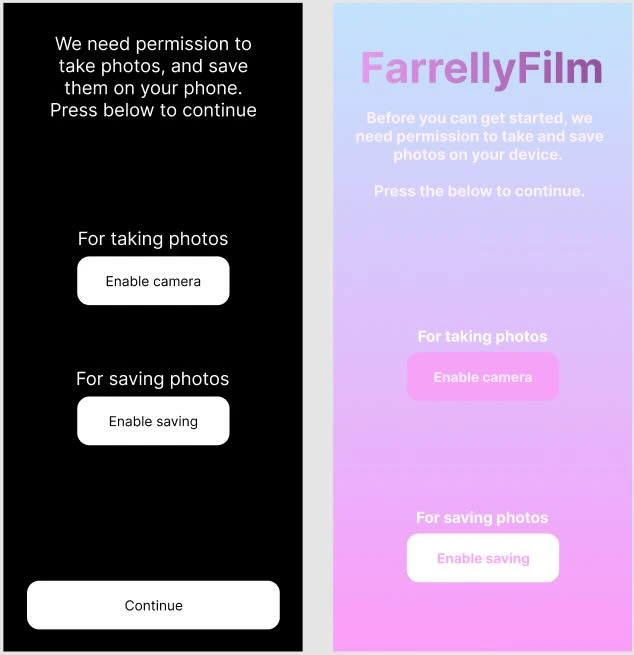
As I had initially thought, I was only going to need 3 screens for the user journey. However, I hadn't considered permissions. I'll need permission to access the camera and to save photos to the user's device. Since this is an MVP I pushed back thinking too hard about this flow and just slapped in a landing page which handles permission prompting.
As a developer trying their hand at design, it can be rough to get going. I know when a UI doesn't look good, but I'd struggle to explain exactly how to fix it. However, I really enjoy going through the process. I'd like to get much better at it. All my prototyping has been done using Figma.
Landing screen#
This screen is where the user lands after first opening the app. It's really function over form, as before the user proceeds these permissions are required to be accepted.
The process I followed in prototyping was to first put exactly what is needed on the screen. Then worry about making it look nicer, later. Function now, form later. The function needed here was to have users accept permissions, then proceed. So I added in a description explaining what is going on and what is needed to progress, along with a buttons for each permission.
Select film screen#
With this screen users are presented a list of film filter options, they need to select a filter and confirm it with the button below. Naturally, given a list of options, I opted for a flatlist to present the filters. I settled on two items per row, as it seemed about the right balance of content options versus visual information.
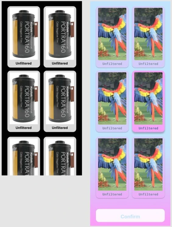
For the filter cards the user needs to know two things, first whether the card is active and in focus. Second, what the filter looks like and it's name. To address the active/inactive state an opacity it set on all cards, however it's turned off for the active card. Which brings in into focus and creates a natural groove for your eyes to focus on when scanning the screen. Each card has their name below and their filter applied on the example image to display the contrast to other filters.
I was worried that users wouldn't be able to contrast the filters with an unfiltered photo. So I decided to add an unfiltered option which is by default selected. A user must make a film filter choice that doesn't include unfiltered to continue, so the confirm button below is disabled while the unfiltered option is selected.
Camera screen#
This is where the magic happens!
In trying to walk the line between realism and ease of use, I opted for realism here and present the screen in landscape. This way it more closely mimics the typical analogue camera look. However, it does provide some friction. As the UX has changed from the app being in portrait mode to landscape. So communicating this effectively to the user is paramount.
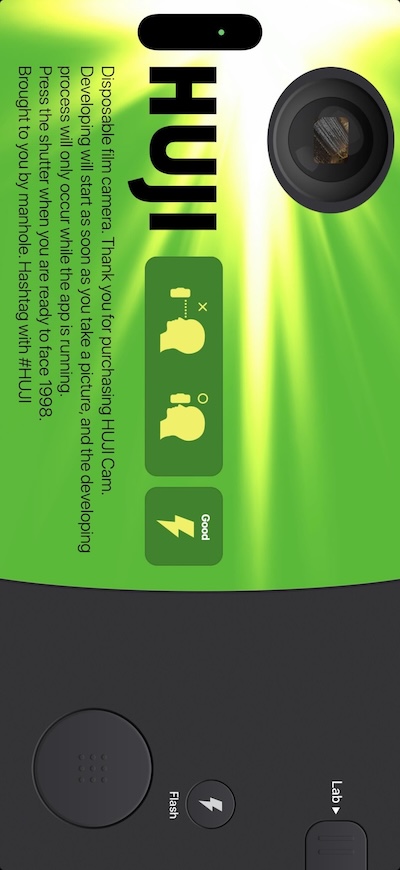
HujiFilm (a similar camera app that has a beautifully interesting filter on all it's photos) was an inspiration here. As they too opted to have their camera presented in landscape mode. They seemed to have navigated the situation by adjusting all text and graphics to the orientation, without actually requiring a user to physically put their phone in landscape mode. That's smart for a few reasons, firstly aesthetically it's more realistic and secondly dealing with devices that have their orientation locked would necessitate displaying a portrait version for those users. All while impacting the aesthetic and realism at play.
Following their example, the camera button is at the bottom right of the screen (in landscape!) with a camera preview at the top left. Along with text and graphics aligned with the changed orientation.
There's also a counter displaying the amount of photos taken out of the total (12). In trying to get a more analogue feel to this screen, all of the buttons will trigger a vibration when pressed. My thinking was to try mimic a mechanical button press, as they have physical feedback where apps generally just have visual feedback. So when you take a photo or turn the flash on you'll get a small vibration as additional feedback.
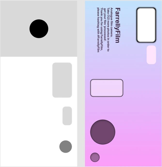
Processed film screen#
The idea for this screen was pretty simple. You get a roll of your film, like you would for the negatives. However, it's the filtered and developed photos you'll see here. It is technically breaking the realism part as a film roll should just be negatives. I like to think of this as a best of both worlds, with realism and ease of use blending together.
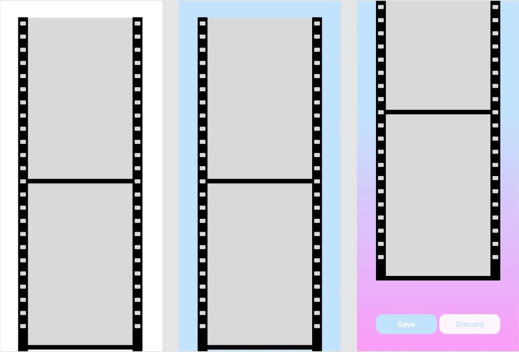
Following from the question I posed and answered above. The user has just two choices on this screen, save or discard all of the photos. Both will result in taking the user back to the Select film screen.
User feedback#
User feedback is the great equaliser of every ambitious (or fledgling...) UX designer. I was lucky enough to have a few friends who were interested in giving the app a go. As well as actually needing at least 12 of them, as the Play Store requires every new app to have run a closed test for two weeks that includes at least 12 unique testers. Interestingly in contrast, the App Store sets no requirement on testing for publication. Outside of their manual testing process where a human reviewer uses the app.
In the early stages of this project I had told a designer friend (relevant below) about this app. They were eager to give it a go, so once I had finished the MVP and published it on TestFlight. I sent them a link to try it out, along with some broad and brief instructions - 'select a filter, take 12 photos, then you'll see them all appear as a roll of film'. Immediately they had a question.
Select film screen#
"I pressed a filter but nothing is happening" - friend
"Oh. You need to confirm it with the button at the bottom the screen" - me
In my haste I had made a few UX miscalculations here. Although I did have a list of options for the user to select from, the 'confirm' button isn't in sight. Which is a bit confusing, how is a user supposed to know you need to select an option then scroll down to the confirm button?
"I pressed the confirm button but nothing is happening" - friend
"Have you selected a filter? You need to tap on one first" - me
More friction - the confirm button is disabled until a filter has been pressed. How is the user supposed to understand that?
I fell back on explaining the entire journey to my friend and helped them through the app (which they did enjoy using!). However, that's not an option if a stranger were to try the app. So something had to change.
I talked through the options with my designer friend. Walking through potential solutions I suggested a change to where the confirm button is located. If I were to take it out of the flatlist and have it ever-present at the bottom of the screen the user would understand the connection between having a filter card selected and the button prompting a 'confirmation'. The button is disabled to begin with, until a choice is made. That change from disabled to enabled state should alert the user that they can press the button and proceed.
However, they saw it differently. They recommended instead changing the flatlist from being vertical to horizontal and swapping the cards out for something smaller. That way more options could be shown while keeping other elements on the screen, like the previewed filter and the confirm button, within focus. While traversing this horizontal list a user could select a filter and have the preview change to the newly selected one. Once the user is happy they press the confirm button.
Which is admittedly, much simpler.
To draw a parallel, it's similar to how Instagram allows you to apply filters when making a Story. A horizontal list of potential filters are shown and pressing on them or scrolling the list applies the filter on the image so you can get a preview.

My designer friend also recommended including some sort of screen title (at the top of the page) which would help direct the user in understanding what goal they're achieving on this screen.
They were all great suggestions, so I got to work and implemented them. Now on the screen we can see:
- A title, directing the user's goal for this screen.
- A preview of how the selected filter affects the photo, providing instant feedback.
- A horizontal list of filter options (where only up to five are visible at a time).
- Which prevents choice overload and stays within short term memory constraints.
- Also follows an established UX pattern.
- A button that a user can interact with to solve their current goal.
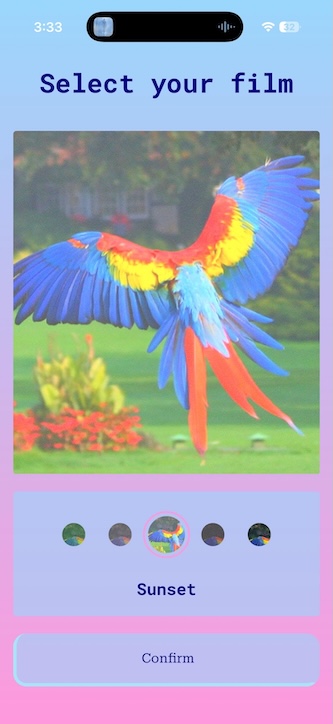
The default option now is also one of the filters. My concern that a user doesn't know what the filters look like in contrast to no filter at all still applies. However, for all the people who have tried the app I haven't had anyone bring it up. Still, in the future I may bring back the unfiltered default choice. Instagram does have users start at an unfiltered step, so there does seem to be some merit in the idea. Although in Instagram's use case you can proceed with making a story post with no filter selected, however in this app you must. A conundrum for future me.
Camera screen#
The feedback that I was got for this screen wasn't quite what I had anticipated. For one, some users didn't know which button was for taking photos. Secondly, they didn't know if a photo had been taken or not.
To address the first point, I followed the same lofi approach I had for the flash button. And slapped a camera emoji on it - easy. On the second point, I was confused initially. As all the buttons on this screen trigger a vibration when pressed. Initially I added it as a way to provide a 'feel' to the buttons, in order to make them more physical. However, that hadn't worked. I concluded that some sort of visual indication was probably best. Playing around with both an iPhone and Android I used their cameras to try see how they answer the same question, 'has a photo been taken?'. What I found is that both camera apps have a shutter effect play over the camera preview when a photo is taken. Subtle genius. So I also added a little shutter animation to the preview.
It really struck me how I'd never consciously thought about the shutter effect in camera apps, but they are ubiquitous. Goes to show that great UX is invisible.
Processed film screen#
The only feedback I've had on this screen was almost predictable. Some users wanted to save only a few photos rather than all of them.
I've gone back and forth here, however any solution that allows the user to choose which photos to save complicates the screen or furthers the origin point of being an analogue camera. So I've decided to stick with it.
Thinking it through#
Outside of the great feedback I received, there were also a few areas where I saw some potential improvements.
You'll notice from the initial designs and MVP, to the final product there was a change in colour for text. I did reuse the design system I made for this website in this project, but when I first bashed together the designs and MVP I wasn't using it. Rolling it out did result in a more consistent theme throughout the app. However, it also removed an accessibility issue I overlooked. I was using light coloured text on a light coloured background. A good example of this is on the landing screen. The descriptive text is white, while the background is a linear gradient of blue and pink - both light colours. It's hard to read. Not withstanding also having accessibility needs around vision and contrast, for your average person it wasn't great either. Luckily bringing in the design system killed two birds with one stone there.
I've also had to rethink how permissions are handled. My initial thoughts were to just put users in a waiting area where they need to accept the permissions to proceed. However, I am aware that best practise is to instead prompt for permissions only when they're needed. I initially thought I was helping users by front loading the experience. But, providing permission to something a user isn't privy to yet feels wrong. I know I can be a privacy and permissions nut. So, as a result, I've shifted the save permission to be prompted only if a user presses the "Save all" button. As for the camera permissions I've left the landing screen to prompt for it. Although, if you've accepted permissions 'only this time' and you've already taken photos you're instead prompted again on the camera screen. I had overlooked this possibility originally. I would like to remove the landing screen doing prompting for permission, however, I'm also worried that I may be flooded with support requests because users are on the camera screen, for a camera app, have denied permission, and are confused as to why they can't take photos. I've not settled on what I'll do here, but I think the camera prompt on the landing screen will ultimately go in favour of it being in the camera screen, where it is actually being used.
Conclusion#
It's always a fun process to put together an MVP. However, pushing that prototype towards being ready for general consumption is always more labourious than you expect. You end up spending time in all the parts of the process you weren't eager to do from the beginning. The final 20% of the work ends up requiring 80% of the effort.
However, it's great seeing to see the final result. Now that the app is live across different stores I've gotten many photos from friends all using FarrellyFilm filters. Which has been a great motivator to improve upon the filters and add more of them.
I've taken away a few good learnings from this exercise and reinforced many that I already had. Such as the importance of user testing. As it will uncover scenarios you hadn't even thought of. Like the take photo button not being obvious. Or users being unsure if they had taken a photo or not.
Keeping user interfaces as simple as possible too, I feel like that was the entire journey of the Select film screen. The screen was just overcomplicated for the task at hand. I managed to blind myself into thinking it was so obvious what to do. However, as we all already knew, not everybody thinks like us. Especially when we've stared at the same screen for countless hours. What seems obvious for one person isn't necessarily true for everybody else.
Following established patterns makes designing/creating a screen easier and will preload any users with contextual understanding. After making the select filter screen changes I didn't have further testers ask how to use it. It became obvious. Just like the learning from the shutter effect for taking photos, great UX is so good it's invisible.
A big shout-out to all my mates who tested the app and helped provide feedback. I wouldn't have been able to release the app without you, nor write this article!